Color Theory for Quilters (How to Choose the Perfect Quilt Color Palettes)
When it comes to quilt design, one of the most intimidating parts can be the fabric pull. Unless you are working with a curated fabric collection or a quilt kit from your local quilt shop, choosing quilt color palettes can feel way outside your comfort zone. In this post, I am going to dive deep into color theory and how different colors work together to create harmonious combinations. I’ll also go over some sources for color inspiration, so the next time you’re staring at bolts of fabric, you’ll being to effortlessly put together a winning fabric selection. And the good news is that you can apply all this information to both solids and printed fabric.
This post may contain affiliate links, which means that I may earn a small commission if you make a purchase using these links. As an Amazon Associate, I earn from qualifying purchases.
What is Color Theory?
Color is an element of art. Color theory is both the science and art of using color. Understanding color theory helps give guidance for color mixing and the visual effects of specific color combinations.
The Color Wheel
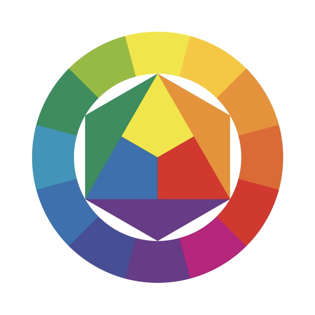
Simply put, the color wheel shows us the relationships between colors. We are going to explore all the ins and outs of the color wheel and how we can use it to put together some amazing quilt color palettes!

Color Wheel Basics
Let’s start with the basics. The color wheel can be broken down into primary, secondary, and tertiary colors.

Primary Colors
Primary colors are used to create other colors. They can not be created by mixing other colors. We know these as blue, red, and yellow.

Secondary Colors
Secondary colors are the result of mixing two primary colors. We know these as violet, green, and orange.

Tertiary Colors
Tertiary colors are the result of mixing a neighboring primary and secondary color. We know these as yellow-green, yellow-orange, red-orange, red-violet, blue-violet, and blue-green.

Warm Vs. Cool
Color temperature can be divided into warm and cool colors. On one side of the color wheel are colors in the yellow, orange, and red spectrums. These are considered warm colors. While colors on the other side of the wheel are in the green, blue, and violet spectrum. These are considered cool colors.

Color Qualities
Pure colors, known as hues, can be manipulated by adding varying amounts of white, black, and grey.
- Hue is the purest form of a color
- Shades are created when black is added to a hue
- Tints are created when white is added to a hue
- Tones are created when grey is added to a hue, muting or dulling the color
In this diagram, the same lime green color is used as a base hue, and then it is altered to create different shades and tints.

Color Harmony
Color harmony refers to aesthetically pleasing color combinations. There are many ways to create harmonious color schemes, but I will color several different methods starting with the least complicated and moving to more complex color combinations.
Color Scheme Methodologies
Monochromatic Color Scheme
Monochromatic color palettes utilize a single hue in a range of values – the tints, shades, and tones. A monochromatic color scheme will range between lighter and darker versions of the base color or hue.
These examples are using my Carbide quilt pattern.


Analogous Color Scheme
Analogous colors are three colors next to each other on the color wheel. You can create an analogous quilt by choosing quilt fabrics that are in similar color families.

Here are a few examples of analogous color schemes. You can see I pulled fabrics that were neighboring each other on the color wheel. I pulled a yellow-green, green, and green-blue combination, a red, coral, and orange combo, and lastly a blue, violet, and red-violet combo. What makes these combinations work is that they are next to each other on the color wheel and they have similar values (lightness/darkness).

These examples are using my free quilt pattern, Apres-Ski, which you can get here.


Complementary Color Schemes
Complementary colors are directly opposite colors on the color wheel. Because you are pulling from opposite sides of the color wheel, complimentary pairs will always have one warm and one cool color. This is why complementary colors tend to feel more balanced. One way to create a complimentary color scheme for a quilt is to make your main fabrics your favorite color and then choose the complementary color as the accent color.

Here are some examples of complementary pairs. Sticking with the primary and secondary colors, I included a blue-orange combo, a green-red combo, and a purple-yellow combo. These color combinations tend to be polarizing, you either love them or you hate them.

These examples are using the Palisade quilt pattern.


Triadic Color Schemes
A triadic color scheme is formed by placing an equilateral triangle on the color wheel. Triadic colors are my favorite combinations because they make for vibrant color palettes and usually have a fun pop of color.

Here are some examples of triadic color schemes. These are some fun and crazy combos. Mardi Gras anyone?

These examples are using the Carbide quilt pattern.


High Contrast Vs. Low Contrast
The last thing to consider when choosing fabrics is contrast. Having a higher contrast between fabric colors will make the quilt pattern stand out more, while a lower contrast will make everything blend more. You can create contrast with either different values (lighter or darker fabrics) or different color temperatures.


On the left is an example of a quilt with similar low-value fabrics in neutral colors. This is a low-contrast color combination. While the quilt on the right is an example of a high-contrast quilt top. You can see there is a big difference in the two color values, which makes the quilt pattern more noticeable.
Where to find color palette inspiration
- I have found that a great place to start when looking for color inspiration is Pinterest! Create a Pinterest board to save new color schemes and fun palettes. I have a several Pinterest boards you can follow.
- Blog posts are another great resource. I have several posts covering color palettes with all the fabrics listed and linked for your convenience.
- Have a free afternoon? Head to the library and browse through the design section. If you find a great book that you can’t live without, consider adding it to your collection.
- What colors do you surround yourself with in real life? What color choices do you bring to your home and your wardrobe? Do you have a favorite piece of art or a favorite outfit that you can draw inspiration from?
If you’re wanting to grow your skills in color palettes then a great way to practice is by using fabric swatches. I use my color cards from Kona Cotton Solids and Art Gallery Pure Solids DAILY. They are an excellent color tool. If you want to learn how to create magnetic swatches as I have, that are easy to mix and match, then check out this other blog post here.

Happy Quilting!
I hope this post showed your some fun and different ways to pull together some winning color combinations. When you are fabric shopping for your next quilt project, take a deep breath and get back to color basics… or throw all the rules out the window and do what feels right. Quilting should be fun, not stressful. Ultimately, there aren’t any rules when it comes to quilting, so just enjoy the process!
